


eBook design
Bright graphics paired with a clean, easy-to-read layout help this eBook to stand out. The pages are easily printed in addition to being easy to read in digital formats. The colorful illustrations compliment the corporate colors while adding a lot of visual interest to maximize engagement.
read moreWootric eBook design
This clean and fresh design uses corporate colors and crisp icons to highlight their content. The information is clear and easy to read in digital formats, which is key with eBook designs.
read moreLogo design and branding
Take a peek at this logo that works in tandem with a bright custom color palette to pack a punch. We love the timeless sans serif font, easy to read design and overall bold look that is fun yet very professional.
read moreWebsite refresh
Here we have a sleek and cool logo and homepage design for the sleekest and coolest of clients! The logo is minimalistic but meaningful, and easy to read both in small and large applications. The website highlights the gorgeous custom photography but keeps to the same polished, sophisticated look.
read morePowerPoint design
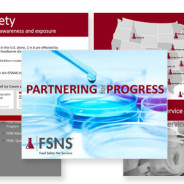
This engaging presentation for the food safety industry checked all the boxes…stylish icons, impactful photography and crisp fonts. The result was strong corporate branding with a playful, interesting aesthetic.
read moreLogo design
The fabulous Sarah Wheat of Sarah Wheat Design knew exactly what she wanted in a logo for her new interior design business. Simple, elegant design and typography create a timeless, versatile logo that is minimal, yet still makes a big impact.
read morePlayful eBook design
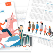
This whimsical and colorful eBook was developed with 15Five and incorporates bright, playful illustrations to compliment all of the excellent guidelines and tips within the text. Stock illustrations kept the project on-budget, but the colors were updated to the 15Five brand to achieve a custom and cohesive feel.
read more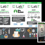
These fun and engaging trade show booth banners incorporate Lab7’s existing branding and graphics, scaled up for the large format. A lot of good information is conveyed in a clean and easy-to-read layout that is as eye-catching as it is informative.
read moreThis bright, fun logo was commissioned for a new fishing charter company in Playa Hermosa, Guanacaste. The project included fine tuning the vivid color palette, several different versions of the logo for various uses and branding guidelines outlining the company’s new branding. The new logo has already been used on the boat, shirts, hats and fleece jackets. Check out logo in action on their beautiful boat, and on their website here!
read more
Laura Lee Daigle was recently on We Are Austin promoting The Junior League of Austin’s A Christmas Affair fundraiser. Laura Lee is the 2016-2017 JLA PR/Marketing chair. A Christmas Affair is the premier fundraiser for the JLA, which gives over $800,000 to the Austin community each year through programs like Coats for Kids and FIT-Food In Tummies.
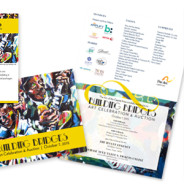
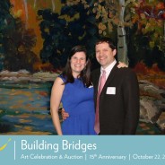
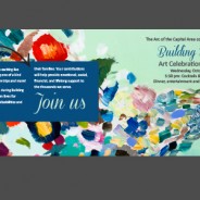
read moreBuilding Bridges 2016
It was a treat to once again contribute to the materials for the Arc of the Capital Area’s Building Bridges Gala. The Theme this year was “Color Outside the Lines” and the vibrant, fun colors matched the festive atmosphere of the event. Building Bridges raised an impressive $240,000 that go towards the Arc’s impactful programs and services.
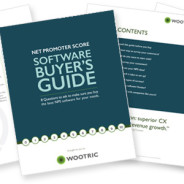
read moreWootric eBook
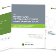
Check out the fun colors and clean, minimalist design on this eBook from San Francisco based company Wootric. It was a great project and very cool to learn about how they are helping organizations all over the world boost customer happiness. Download the eBook here.
read moreRemote teams infographic
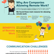
Take a look at this fun (and informative!) infographic developed by 15Five and designed by Laura Lee Daigle of LLB Designs.  Colorful sections and whimsical illustrations help pack a lot of information into one engaging graphic. Read more about it on 15Five’s site here.
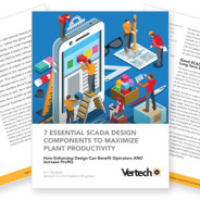
read moreeBook design
There have been a lot of eBook and whitepaper design requests coming down the pipeline the past several months. Developing your own original content is an important part of a company’s marketing strategy and a relatively low-cost way to get your ideas and brand out there. A well-designed eBook is eye-catching but clean and easy-to-read. It should work well with your branding, but have a bit more of an editorial feel to it as opposed to typical marketing materials. A handful of eBooks designed by LLB Designs can be found here,...
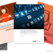
read moreSmart Marketing for Engineers book design

Take a look at Rebecca Geier’s newly published book, Smart Marketing for Engineers. This was a big project for LLB Designs in 2015 and it has been very exciting to see the book come to life. Â The project included the design of a 235 page book as well as covers and front matter. The book was published in hardcover as well as Kindle and eReader electronic versions. We also designed promotional materials including an author one-sheet and a landing page for the TREW website. And of course no book launch would be complete...
read more15Five: An Uncertain Future eBook
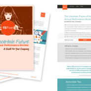
15Five is an exciting new LLB Designs client out of San Francisco, CA. They recently published an eBook, “The Uncertain Future of the Annual Performance Review” This colorful and fun eBook gives a history of the the Annual Performance Review and offers insights on why some companies are abandoning the process in favor of more innovative and effective ways of managing employee growth. The eBook design is by LLB Designs, as is the landing page.
read moreWineman Technology feature graphic
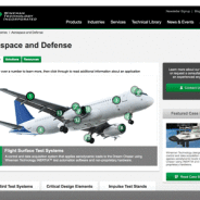
Take a look at this interactive feature image on the Wineman Technology website. Longtime partner TREW Marketing asked us to help create a dynamic, interactive image for Wineman’s Aerospace and Defense page. The different areas of the plane are numbered and as you rollover the numbers brief descriptions of the different sections are displayed in the easy-to-read box below. It is an intuitive and fun way to present a lot of information in one simple image.
read moreBuilding Bridges 2015
This year’s Arc of the Capital Area Building Bridges fundraiser materials may have been the most cohesive and impactful yet. The lively artwork perfectly reflected the jazz and art deco theme. Special attention was given to online and digital components which coordinated with the more traditional printed materials beautifully. The event was a big success for the Arc and is always an honor to be a part of!
read moreArc of the Capital Area fundraising collateral
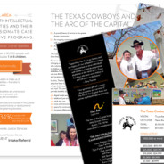
One of our favorite local non-profits, The Arc of the Capital Area, often works with University of Texas service organization the Texas Cowboys. These two dynamic groups are partnering up again to raise funds to purchase the Arc’s new building, and we got to work on some fundraising materials including a bifold and insert. Fun photography, Texas-themed icons and a full page infographic all worked together to create a compelling story. The large infographic can also be leveraged as a stand-alone piece via print collateral, their...
read moreSnippets
A quick peek at some of our recent projects – a pretty even mix of favorite old clients and exciting new ones. Loving all of the bright colors!
read moreSimple updates, big impact
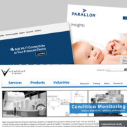
One quick and relatively easy way to keep your site fresh and up-to-date is to periodically replace the feature images and hero graphics. This one change can make a big impact, while still maintaining your site’s existing branding and consistency. It’s also a great way to highlight your latest news, products or events. Shown above are recent feature images we created for Silex Technology, Viewpoint Systems, and Parallon. All projects were managed by TREW Marketing.
read moreEven More Hands On
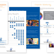
We’ve been lucky enough to work with Hands On Atlanta on several projects over the last few months, including the recently posted Soiree event. Â This neat organization has also been putting together a 25th anniversary campaign, as well as coordinating a variety of ongoing events including MLK day volunteer activities, Family Service Saturdays, corporate volunteer days, and more. We jumped in and helped out with campaign and fundraising documents, as well as logos and signage for various activities and events. Â It’s always a...
read moreSoiree for Hands On Atlanta
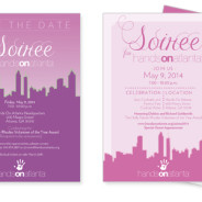
Hands On Atlanta put on yet another great event: Soiree for Hands On Atlanta. This elegant fundraiser and auction also celebrated Hands On Atlanta’s core work, their role in the community, and of course honored their very dedicated volunteers. LLB Designs created the save the date and invitation, signage, and other event materials. We loved the unique use of fuchsias and pinks, which created a distinctive and fun vibe throughout the event lighting, linens, flowers and printed materials. Well done, HOA!
read moreCanyon Vista Guest Speaker Series
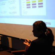
Laura Lee Daigle recently participated in the Canyon Vista Journalism’s Guest Speaker Series in Austin, TX. She spoke to news media and yearbook students on graphic design, branding, and her career in marketing and design. The presentation included interactive exercises such as “Guess the Brand” and “Let’s Make this Poster Design Better” as well as an overview of key design principles and Daigle’s portfolio of work. A casual and fun Q&A session followed the presentation.
read moreMills Wine Group logo
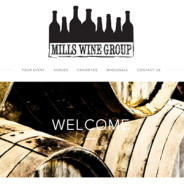
An overdue sneak peek at a logo we did for Mills Wine Group in the California Bay Area. We love the rustic font and cool, stamp-like feel of both the full logo and the smaller option that we created for additional flexibility. The bottles all grouped together remind me of a gathering or party, but actually made my husband think of a skyline. It looks great on their web page, and was all in all a fun project with a fun client. Bottom’s up!
read moreHands On Atlanta t-shirt
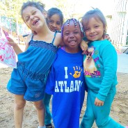
Take a quick peek at this cute photo of the t-shirt design we recently designed with Hands On Atlanta!
read moreOLLI + CROU logo and branding
New children’s resale shop Olli + Crou came to us looking for a logo and color palette. Owner Amanda has great taste and we love the results! Â The final branding package included a detailed color palette, font guidelines and several color options for the logo.
read moreBuilding Bridges 2014
The 15th anniversary of the Arc of the Arts Building Bridges event was a success! We designed the save the date, invitation and program for the event. Each featured two beautiful pieces of artwork: “Serenity in Fall†by Arc of the Arts Artist Nancy D. and “Perpetual Light†by local artist Rebecca Patrick. We pulled some of the reds and blues from each piece to tie the collateral together. The invitation was a unique matchbook fold, which also housed a separate insert card. Thanks for a wonderful evening, Arc! Photo courtesy of...
read moreThe Final Coat logo
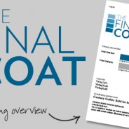
We got to design a logo for this great new business out of Houston, TX. The Final Coat is a high-end painting company specializing in both residential and commercial projects. They wanted a crisp, classic logo that would stand out in a field of swishy paint brush  and splattered paint can logos. The final result features subtle typography that plays on the name and emphasizes the quality of the company’s work. We also spent a lot of time fine-tuning the shades of blue — looking for a shade a touch darker than royal blue,...
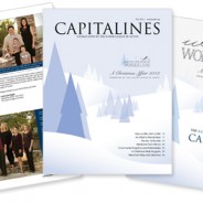
read moreCapitalines magazine, Spring 2014
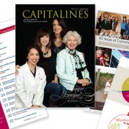
Here is a look at the spring 2014 issue of Capitalines Magazine! Laura Lee Daigle wrapped up her term as  2013-2014 editor of Capitalines, which is a publication of The Junior League of Austin. This issue featured a custom cover photo shot by Debra Gulbas Photography, design by Andrea Turner Jacobs, and 80th anniversary artwork by Terrence Moline of TeamMoline. Custom infographics, fun and informative articles about local non-profit programs and high quality photography made for an eye catching and entertaining issue. The full online...
read moreCongrats to Dropcam!
Back around 2010-2011 we did some design work for a tiny San Francisco startup called Dropcam. We were (and still are!) big fans of their products and had a good feeling about them. Last week the now not-so-small company was acquired by Nest (which itself was recently acquired by Google). We are so proud of the Dropcam team and excited to see what they do next.
read moreHome Building News Magazine

Here is a peek at the latest issue of Home Building News, a publication of the Homebuilder’s Association of Tulsa. We dressed up the publication with a streamlined masthead, clean, attractive layouts and playful icons. The overall look is professional and appropriate, but still fun and relaxed.
read moreThe Thirsty Quail
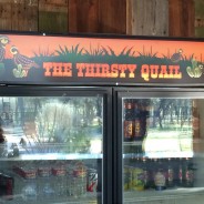
Take a look at this unique and envy-worthy refrigerator for a new outdoor kitchen. Our client asked us to design a custom sign featuring quail and cacti with a fun, Texas flavor to it.  It turned out great, and was a blast to work on. We’re pretty jealous of the fridge and also impressed with the coolness of  what looks to be a reclaimed wood wall behind it. Nice work, Covey family!
read moreFUMP Music Festival
Ever seen a kiddie mosh pit? We at LLB Designs were excited to sponsor the FUMP Family Music Festival again this year. The event featured several great children’s bands, an appearance by Elmo and Cookie Monster, games, prizes, a silent auction and more. Not only was it a fun event, but it involved great design, too. Check out the beautiful website design by Andrew Leeper below.
read moreWord.
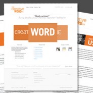
Check out The Creative Word PR’s sleek and stylish website! It was exciting to create this new website for one of our favorite strategic partners. Anne and Melissa wanted something clean and modern, focusing on their core niche: public relations and writing for small businesses and nonprofits. The final result is a WordPress website that is sophisticated and professional, but with well-defined branding and punchy colors. The rotating hero graphic is unique and reinforces the company name and specialty, while their cheeky blog, WORD,...
read moreCapitalines magazine
Take a peek at the most recent issue of Capitalines Magazine! Laura Lee Daigle is the 2013-2014 editor of Capitalines, which is a publication of The Junior League of Austin. It covers the League’s community and non-profit programs and grants, as well as details on their big fundraiser, A Christmas Affair (ACA).  The full online version can be found here. The fall issue has a circulation of over 3,000, and the shopping guide is distributed to 20,000 guests during the ACA event. More information about the publication, including a media...
read moreOut and about: Is your shopping list covered?
As the holiday season kicks into high gear, so does America’s consumer culture. This naturally means more shopping and thus more advertising. Design and advertising go hand in hand, and during the months of November and December most marketing efforts feature traditional holiday icons such as red, green, ornaments, pine trees, etc. The timing and the subject matter may not have changed much, but the methods have. Within the last ten years or so, more people have opted to avoid headaches like this: Photo courtesy of abcnews.com In favor of...
read moreOut and about: And for your main font?
Restaurants are always playing around with different menu designs, but for the most part, the look of a menu is a clear indicator of how informal or upscale the establishment is. Image via wafflehouse.com/menu Generally, a high-end place will use a simple, elegant design, and often corporate chain menus often have more imagery and detailed descriptions of the food. Casual restaurants are typically attempting to attract customer volume and families, so the menu needs to be engaging as well as easy to read, which helps patrons make decisions...
read moreHip hip hooray!
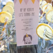
There is nothing cuter than a first birthday party, and this one, complete with hippo theme, was extra fun. The invitation was by LLB Designs, and the photography was by Bridget McPherson. Â The rest was all coordinated by the proud parents, and do doubt involved a lot of shopping on etsy and driving around town rounding up mason jars. Congratulations, and well done! Photography by bridgetmcpherson.com
read moreOut and about: At the movies
Image via maxseesmovies.blogspot.com As with most types of design, movie credits can range from very minimalistic to long and complex sequences. All intend to capture and engage the audience while showcasing the title, cast, and crew, and it’s interesting to see how the trends change over the years. The use of an intricate and glitzy design to display the title and credits is far more common in older films. A lot of classics have an overture play while the credits are shown against stills from the movie. This is particularly true of...
read moreCupcakes and Cocktails
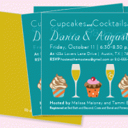
Who wouldn’t want to go to a Cupcakes and Cocktails party!? This little invitation was a custom design project featuring some juxtaposed typography and bright, happy fall colors. The square shape and punchy gold wash on the back are details that add that little something extra…
read moreOff-topic: Newborn photography
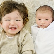
It takes a talented, patient person to take good newborn photos. Add in a feisty big brother and what you really need is a miracle worker. Johanna of HannaMac photography is just such a person. Enjoy a few of her photos below, and see more of Johanna’s beautiful work on her website.
read moreBuilding Bridges 2013
The Building Bridges Art Celebration and Auction is next week!  This truly unique event features silent and live auctions with work from professional artists as well as the clients enrolled in the amazing Arc of the Arts program. The save the date, invitation and program were designed by LLB Designs through the Doing our Part Program. The save the date and the front of the invitation feature the piece “Four Lightning Strikes†by Arc of the Arts Artist Kelly R. The inside of the invitation features “A Step†by Austin artist Starla...
read moreSocial sizing
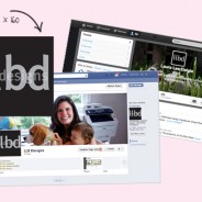
Check out this extremely useful post on Facebook image sizes. We recently gave our Facebook and Twitter profiles a fresh new look…follow us here!  Facebook  Twitter
read moreOff topic: storybook gallery wall
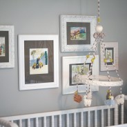
When it came time to decorate our second baby’s new nursery, we found ourselves faced with a little helper and a big blank wall: As a graphic designer I tend to like art that is graphic and a bit unique, but still very classic. For this space we decided to frame children’s illustrations to create a colorful, sweet, nursery-appropriate gallery wall. The pieces themselves were taken from vintage children’s books. We ordered some of our childhood favorites from eBay and etsy and then pulled the most nostalgic illustrations. We...
read moreProcare postcard campaign
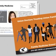
Take a look at these two new postcards designed for Procare Medical Center out of Austin and San Antonio, TX. We combined contemporary illustrations with the company’s colors and fonts and logo for two eye-catching pieces full of information including a custom map, a bio and headshot, and list of services.
read moreWDi catalog and brochure
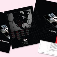
This catalog and brochure project was a big, exciting collaboration with Mixtape Marketing. We worked with the existing WDi branding and colors to develop fresh new collateral with a bold look appropriate for the industry. Cover art mimics the shape of the company’s logo and features key products and application shots. Inside scaled back schematics and clean, consistent layouts help make all of the information and content easy to digest.Â
read moreA Taste for Volunteering
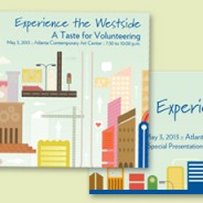
Hands on Atlanta recently held its 11th Annual A Taste for Volunteering. This year’s event featured the theme, “Experience the Westside” and drew 300 guests. LLB Designs contributed artwork for some of the collateral including the invitation, program, Facebook banner and tickets. Bright illustrations and fun fonts gave the event an urban and colorful look.
read moreBuilding Bridges gala invitation
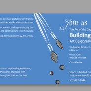
Arc of the Arts is an amazing Austin organization that offers art and music classes to adults with developmental disabilities. We’ve volunteered with the program in the past and absolutely love it, so it was exciting when they asked for some help with the design of their Building Bridges gala materials. And as if the project itself wasn’t exciting enough, we also got to use amazing artwork from both local professional artists and clients of the Arc of the Arts program on the collateral. First up was a simple save the date...
read moreMixing in a little trade show collateral
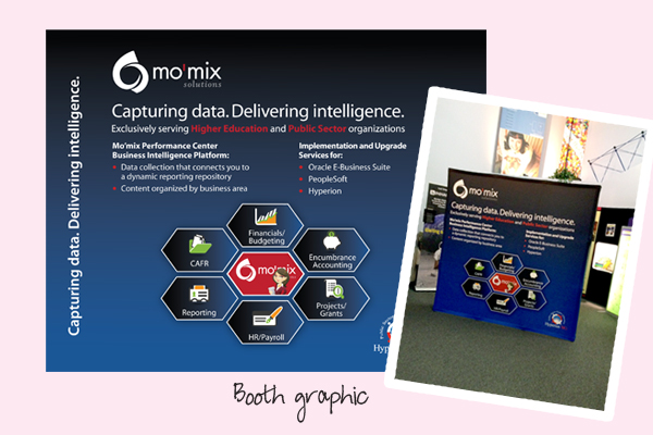
A lot of our work lately has been smaller in scale, if not in scope, so it was a fun change to work on something BIG. TREW Marketing managed this neat project and asked for some graphics for a trade show pop-up booth. The design included a large-scale information graphic featuring colorful icons and a brief overview of services. A coordinating flyer re-enforced the fun and colorful branding and gave visitors a little something to take with them to keep the company top-of-mind.
read moreTasty web work
Take a look at these two new web pages for the parent company of Blake’s on 6th and Elevated Artisanal Goods, both in Austin, Tx. Elevated needed a landing page with brochure-type content about their catering business. And then next up was a one-page umbrella site linking back to the sister websites. Mixtape managed and developed the sites and LLB Designs did the design work.
read moreTreking along
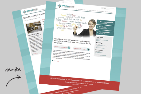
It was a privilege to work with Trek Global (formerly Adaxa USA) on their new website and corporate identity. This was a big project and a solid team effort all around. Our part included web design and layout, establishing fonts and colors and consulting on the logo design as well as corporate materials like business cards, banners and letterhead.
read moreA baby shower, y’all
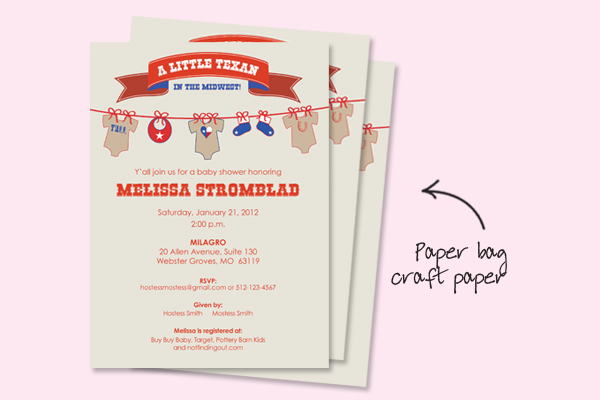
This invite is a custom design for a Texas girl living in the midwest. A red, white and blue color palette printed on paper bag craft paper gives it a youthful, western feel without getting cutesy. No word yet on if the little one will be a cowboy or a cowgirl, but we here at LLB Designs have our suspicions…
read morePharmacy slide deck
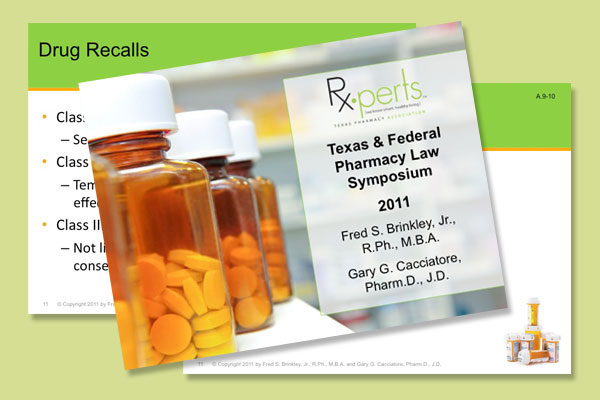
This colorful PowerPoint presentation is a great example of how a clean, simple template can have a big impact. Because the slide deck was long and contained so much information it was important to keep the design flexible and easy to work with. Bold, relevant images and complementary colors add some visual pop, without overwhelming the content.
read moreTeam players: San Francisco 49ers handout
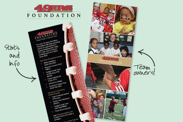
One of the best things about the the San Francisco 49ers is that they are as active in the community as they are on the football field. The 49ers Foundation, whose mission is “Keeping Kids Safe, on Track and in School,” leverages the well known NFL team and players to raise money for community programs for underserved youth in the Bay Area. So tally that up as a win!  LLB Designs was asked to create a little handout highlighting some of the Foundation’s key stats including the $10 million that has been given back to the...
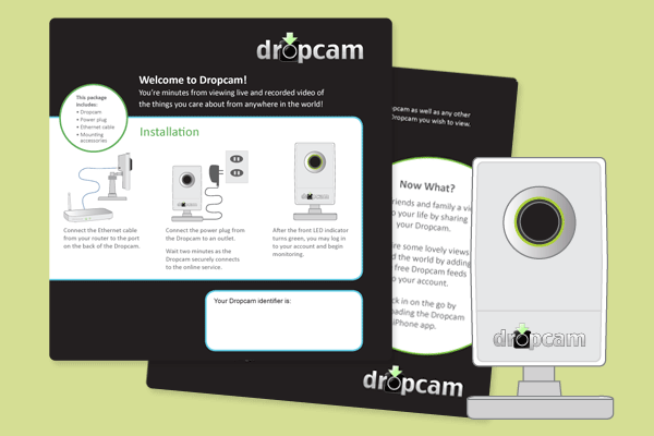
read moreDropcam packaging collateral
Meet Dropcam, an exciting young bay area company that makes easy-to-use video cameras that let you watch your baby, your puppy, your employees — whatever you want — right over the internet. You just plug in the camera and it connects to the internet so you can watch from anywhere using a browser. Neat, right? We were thrilled when they came to us at LLB Designs with a packaging project: a custom instruction sheet to fit into the box that the product ships in. The project included fine-tuning the company’s colors and...
read more