


As the holiday season kicks into high gear, so does America’s consumer culture. This naturally means more shopping and thus more advertising. Design and advertising go hand in hand, and during the months of November and December most marketing efforts feature traditional holiday icons such as red, green, ornaments, pine trees, etc. The timing and the subject matter may not have changed much, but the methods have. Within the last ten years or so, more people have opted to avoid headaches like this:
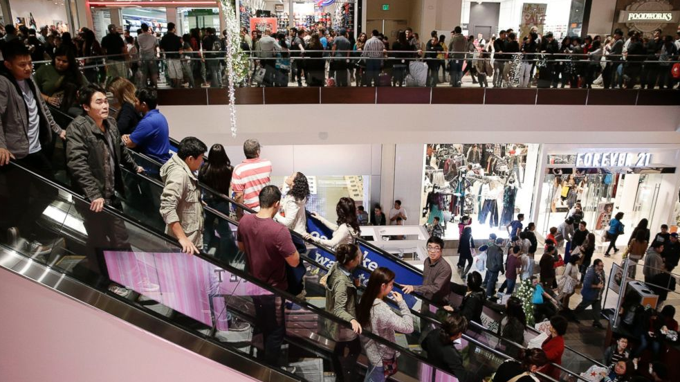
Photo courtesy of abcnews.com
In favor of something more like this:
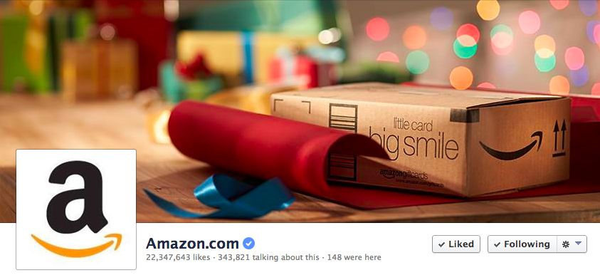
It’s not news that Amazon.com has become the king of online shopping. With thousands of consumer goods spanning numerous departments and fast two-day shipping for Prime members, it’s not much of a challenge for them to draw business. Aside from their trademark smiley face arrow that subliminally suggests happiness and forward progression, they also market the fact that they are willing to take care of the gift wrapping process. This is clearly seen on their Facebook page which acts as a virtual holiday billboard.
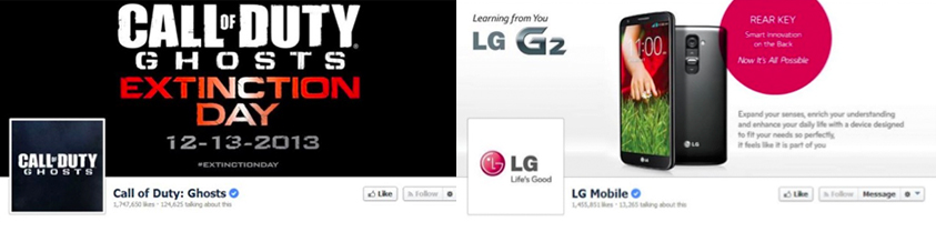
The virtual billboard concept has been adapted by a number of companies that use Facebook as a way to promote their products. Some, like Amazon, redesign their banners to adhere to the holiday season, while others are more interested in strictly promoting their products. The latter is more common with companies whose products are sold in a number of outlets. Take for example an electronics company like LG, or a popular video game such as Call of Duty. Both use a Facebook banner design that is purely about the products and have nothing to do with the holiday season, despite being popular gifts.
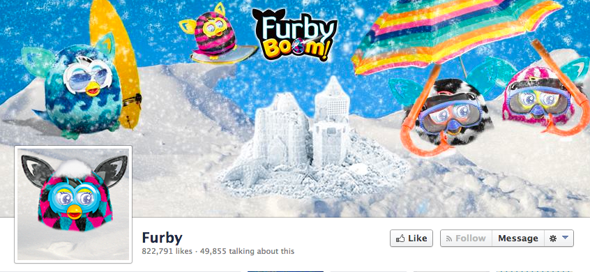
One the other end of the spectrum, a popular gift like the Furby Boom is all about being as seasonally festive as possible. This is likely due to the fact that some gifts decline significantly in sales after the holidays, so it is important for them to take advantage of the season.
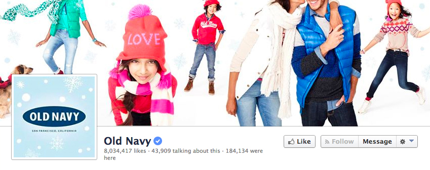
The three largest Gap, Inc. brands all have different approaches to their Facebook artwork. Old Navy’s cover photo features people, photography and general winter outerwear.
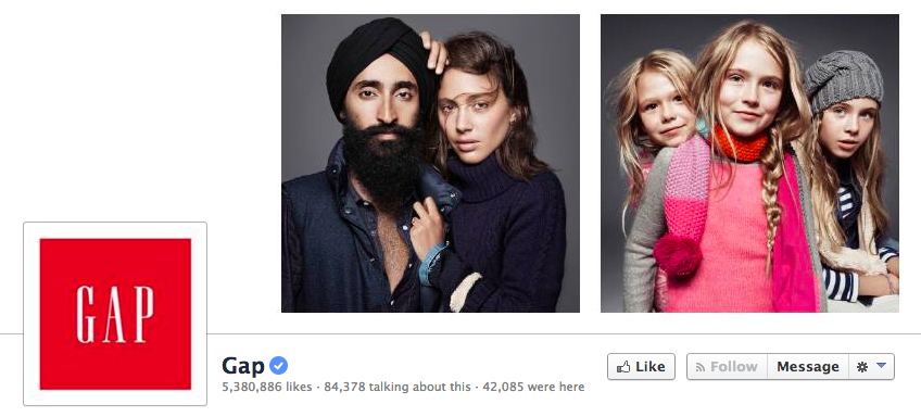
Gap went more minimalist, with a sleek pair of photos and lots of whitespace. The craziest thing about it is their logo in the profile photo, which is a holiday red logo, rather than their traditional blue.
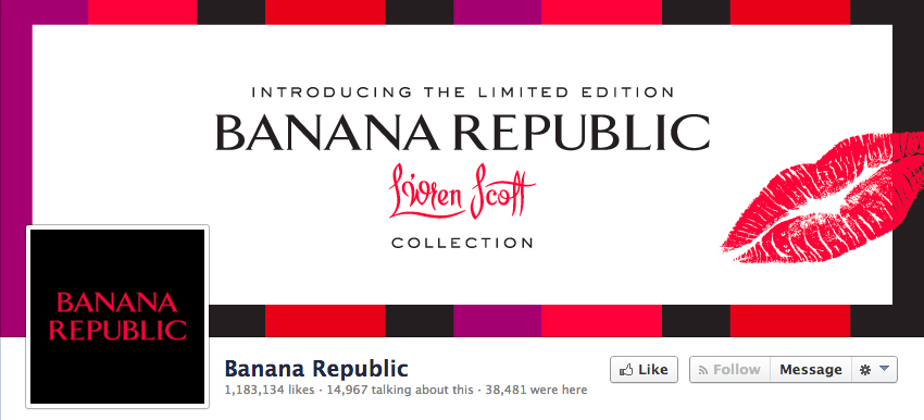
Banana Republic shows no mention of winter or holidays at all, other than perhaps the subtle use of color; instead they highlight a new design collaboration. No product shots and no typical Banana Republic color palette, but their typography is so distinctive that the overall look is still in line with their brand.
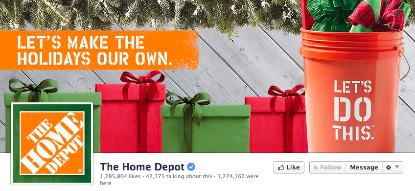
Whether you’re offering diamond earrings or a new leaf blower, trees, packages and red bows always set the mood. Tiffany & Co. and Home Depot advertise decidedly different products, but both rely on their well known colors and classic holiday imagery to stay top-of-mind with shoppers. 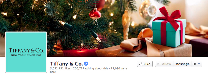
‘Tis the season for shopping and advertising! In this modern era it is impossible to avoid exposure to the looks companies create to sell their products. Whether you like to shop till it hurts, or save your gold like Scrooge, chances are you will have to move into a cave (without Wi-fi) to avoid the holiday designs.
– By Lawson Box
©2013 LLB Designs. All rights reserved.
Works featured are the property of their respective owners.