


Image via maxseesmovies.blogspot.com
As with most types of design, movie credits can range from very minimalistic to long and complex sequences. All intend to capture and engage the audience while showcasing the title, cast, and crew, and it’s interesting to see how the trends change over the years.
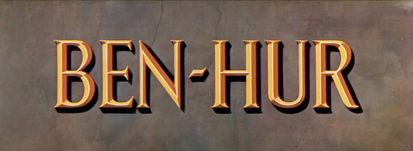
The use of an intricate and glitzy design to display the title and credits is far more common in older films. A lot of classics have an overture play while the credits are shown against stills from the movie. This is particularly true of famous epics like Ben Hur and Doctor Zhivago. Sometimes filmmakers create these sequences to establish mood and introduce the movie’s characters, but occasionally they seem to do it just for the hell of it.
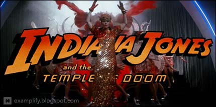
Image via examplify.blogspot.com
Take Indiana Jones and the Temple of Doom; Cate Kapshaw is singing “Anything Goes†in Mandarin while running around in a cave filled with dancers, glitter, wind, and ribbons. This is in complete contrast with the style of the movie and the other films in the series. Of course who can forget Star Wars? While there are no credits shown, the opening title is one of the most dramatic and memorable. A lot of critics say that the gripping introduction helps to suck the audience in and hold them captive while the story is told.
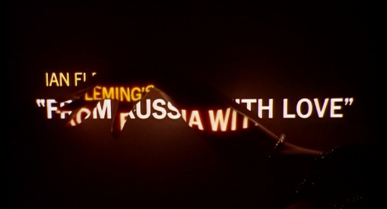
Image via theincrediblesuit.blogspot.com
Almost every James Bond movie features a lengthy opening credits sequence consisting of a dramatic song with provocative imagery, all alluding to various characters and plots. These elaborate pieces are practically short films unto themselves.
Over the past decade or so it has been far more common for a movie to keep the title and credits simple. Michael Mann’s 2004 thriller Collateral, for example, has neither a title nor credits, the film just starts. Some argue that this prevents the audience from getting distracted by the big name celebrities and allows them to focus on the story.
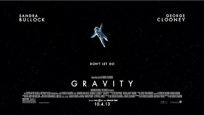
Image via www.cinecritical.com
The current top two films at the box office, Captain Phillips and Gravity, both have very simple designs used for the opening title and credits; it is just simply the title and main cast, with no elaborate graphics, dancing, or trippy imagery.
One thing that is consistent is the key role that typography plays. Simple or complex, it makes a statement that is as important as the words themselves. The art of filmmaking has matured a great deal over the years, and artists are constantly creating new and innovative ways to show title credits. This is fun and keeps the audience on its toes, but what is truly important is that the introduction is designed to best complement the film in its entirety.
– By Lawson Box
©2013 LLB Designs. All rights reserved.
Works featured are the property of their respective owners.