The Final Coat logo

Posted by on Aug 5, 2014 in Graphic design, Branding | 0 comments

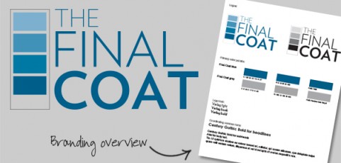
  We got to design a logo for this great new business out of Houston, TX. The Final Coat is a high-end painting company specializing in both residential and commercial projects. They wanted a crisp, classic logo that would stand out in a field of swishy paint brush  and splattered paint can logos. The final result features subtle typography that plays on the name and emphasizes the quality of the company’s work. We also spent a lot...

Read More

Home Building News Magazine

Posted by on Jun 25, 2014 in Graphic design, Branding | 0 comments

Here is a peek at the latest issue of Home Building News, a publication of the Homebuilder’s Association of Tulsa. We dressed up the publication with a streamlined masthead, clean, attractive layouts and playful icons. The overall look is professional and appropriate, but still fun and relaxed.

Read More

Word.

Posted by on Jan 30, 2014 in Graphic design, Branding | 0 comments

Check out The Creative Word PR’s sleek and stylish website! It was exciting to create this new website for one of our favorite strategic partners. Anne and Melissa wanted something clean and modern, focusing on their core niche: public relations and writing for small businesses and nonprofits. The final result is a WordPress website that is sophisticated and professional, but with well-defined branding and punchy colors. The rotating hero...

Read More

Procare postcard campaign

Posted by on Jul 3, 2013 in Graphic design, Branding | 0 comments

Take a look at these two new postcards designed for Procare Medical Center out of Austin and San Antonio, TX. We combined contemporary illustrations with the company’s colors and fonts and logo for two eye-catching pieces full of information including a custom map, a bio and headshot, and list of services.        

Read More

WDi catalog and brochure

Posted by on Jul 1, 2013 in Graphic design, Branding | 0 comments

This catalog and brochure project was a big, exciting collaboration with Mixtape Marketing. We worked with the existing WDi branding and colors to develop fresh new collateral with a bold look appropriate for the industry. Cover art mimics the shape of the company’s logo and features key products and application shots. Inside scaled back schematics and clean, consistent layouts help make all of the information and content easy to...

Read More