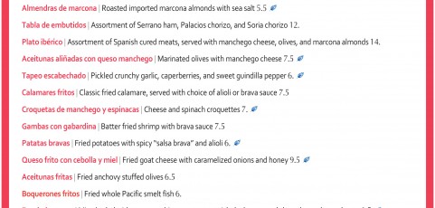
Restaurants are always playing around with different menu designs, but for the most part, the look of a menu is a clear indicator of how informal or upscale the establishment is. Image via wafflehouse.com/menu Generally, a high-end place will use a simple, elegant design, and often corporate chain menus often have more imagery and detailed descriptions of the food. Casual restaurants are typically attempting to attract customer volume and...
Cupcakes and Cocktails
Who wouldn’t want to go to a Cupcakes and Cocktails party!? This little invitation was a custom design project featuring some juxtaposed typography and bright, happy fall colors. The square shape and punchy gold wash on the back are details that add that little something extra…
Procare postcard campaign
Take a look at these two new postcards designed for Procare Medical Center out of Austin and San Antonio, TX. We combined contemporary illustrations with the company’s colors and fonts and logo for two eye-catching pieces full of information including a custom map, a bio and headshot, and list of services.
WDi catalog and brochure
This catalog and brochure project was a big, exciting collaboration with Mixtape Marketing. We worked with the existing WDi branding and colors to develop fresh new collateral with a bold look appropriate for the industry. Cover art mimics the shape of the company’s logo and features key products and application shots. Inside scaled back schematics and clean, consistent layouts help make all of the information and content easy to...
Parallon web design
We have had the privilege of working with TREW Marketing on several of their projects this past year. Take a look at this new website design for Parallon Business Solutions.

