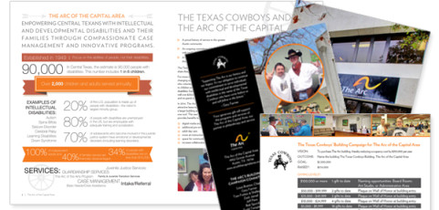
One of our favorite local non-profits, The Arc of the Capital Area, often works with University of Texas service organization the Texas Cowboys. These two dynamic groups are partnering up again to raise funds to purchase the Arc’s new building, and we got to work on some fundraising materials including a bifold and insert. Fun photography, Texas-themed icons and a full page infographic all worked together to create a compelling story....
Snippets
A quick peek at some of our recent projects – a pretty even mix of favorite old clients and exciting new ones. Loving all of the bright colors!
Simple updates, big impact
One quick and relatively easy way to keep your site fresh and up-to-date is to periodically replace the feature images and hero graphics. This one change can make a big impact, while still maintaining your site’s existing branding and consistency. It’s also a great way to highlight your latest news, products or events. Shown above are recent feature images we created for Silex Technology, Viewpoint Systems, and Parallon. All...
Even More Hands On
We’ve been lucky enough to work with Hands On Atlanta on several projects over the last few months, including the recently posted Soiree event. Â This neat organization has also been putting together a 25th anniversary campaign, as well as coordinating a variety of ongoing events including MLK day volunteer activities, Family Service Saturdays, corporate volunteer days, and more. We jumped in and helped out with campaign and fundraising...
Canyon Vista Guest Speaker Series
Laura Lee Daigle recently participated in the Canyon Vista Journalism’s Guest Speaker Series in Austin, TX. She spoke to news media and yearbook students on graphic design, branding, and her career in marketing and design. The presentation included interactive exercises such as “Guess the Brand” and “Let’s Make this Poster Design Better” as well as an overview of key design principles and Daigle’s...
Mills Wine Group logo
An overdue sneak peek at a logo we did for Mills Wine Group in the California Bay Area. We love the rustic font and cool, stamp-like feel of both the full logo and the smaller option that we created for additional flexibility. The bottles all grouped together remind me of a gathering or party, but actually made my husband think of a skyline. It looks great on their web page, and was all in all a fun project with a fun client. Bottom’s...